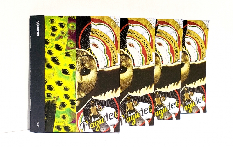
After a chance meeting at a graphic design workshop in Santo Domingo, Dominican graphic designers Steven Catalino and Vanessa Vallejo created Unzine. A playful, partly improvised reinterpretation of the city around them and its myriad of cultural and commercial signals, it turns the tables on any idea of a hermeneutic classical canon and elevates the mundane and culturally opaque. Exclusively for Kultwatch, Steven and Vanessa show off individual pieces from the project and talk about the motivation behind it and its relation to advertising culture.
Steven Catalino (SC): — I’m a Dominican graphic designer. I got a BFA in graphic design at Utah State University in the United States. I work as the lead graphic designer for one of Dominican Republic’s most prestigious universities. I resort to my personal projects as a way of dealing with the stress from work and the pains of living in a chaotic city. Santo Domingo is a city with a few attractions but with many more issues, ranging from faulty infrastructure, daily traffic jams, blackouts, high crime rates, economic inequality and a classist society, to the everlasting humid heat, loud neighbors, and unaesthetic public spaces. It gets to you, makes you feel stagnant and repressed.
Vanessa Vallejo (VV): — I was born in Mexico City, where I lived for ten years. I’m also half Dominican and currently live in Santo Domingo. Right after graduating from The Altos de Chavón School of Design, I started working as an In-house Graphic Designer for the school’s Cultural Center Foundation, which also includes an archaeological museum and art gallery. Then I began working for one of the Dominican Republic’s leading companies in the field of cocoa production and exports; where I currently design packaging, digital and editorial pieces for their various products and services.
We’ve frequently picked up elements from advertising, without any particular intention to do so, because it’s always out there right in our faces.
SC: — I met Vanessa at a design workshop last year. We only had a short conversation, yet I quickly realized how much we had in common as designers. Months later, we went out for a drink and decided to start a personal project together. We came up with the idea of making a zine.
The premise of the project is to portray any interesting visual or conceptual objects we encounter in our everyday lives. Often inspired by the mundane, this exercise makes you more attentive and insightful to your surroundings, sparkling a little nuance into an otherwise monotonous environment. We’ve frequently picked up elements from advertising, without any particular intention to do so, because it’s always out there right in our faces.
Formally, our designs have no rules besides the format, an 8-page, 4.25×5.5” zine. There’s no intentional narrative nor mutual agreement about the direction of the pieces.
VV: — Without any other rule than the quarter-letter-page format, our pieces result in random graphic interpretations of events, feelings and peculiar eye-catching phenomena that we encounter within our messy surroundings in Santo Domingo.
Thanks to Steven’s initiative to start the Unzine project, I’ve managed to drive my energy towards less serious, yet equally interesting, creative goals than what I’m used to with my work. I tend to rationalize a lot, but he reminds me that the idea of our side project is just letting go and experimenting with the power of a totally unnecessary communication task.
![]()
SC: — The cover for this zine is a collaboration between Van and I. The individual pieces of the zine are inspired on personal experiences, so we figured that the cover must be based on a mutual experience. In one of our meetings at a bar, they were showing the movie Legend of the Guardians. We just thought it was funny and weird to see owls with human-like facial expressions, as portrayed in the movie. We went on to split an image and manipulate it without any mutual coordination.
VV: — Steven and I got to manipulate a different half of the image without having established any intention, technique, or style. It was intriguing to reveal our finished halves to each other and discover an odd-looking remix after putting them together.
On my side of the cover, I feature some paper coasters that I grabbed at the bar where I met with Steven to discuss the project. I ripped them apart and scanned their pieces, so I could rearrange them digitally, merging both Dominican beer brands.
![]()
SC: — This piece is a fake ad for the National Institute of Transit and Terrestrial Transport (INTRANT). The INTRANT is one of the government institutions in charge of dealing with public transit infrastructure, which is partly the cause for the awful traffic we experience daily in Santo Domingo.
One day I was in a long line to pay the taxes to renew my driver’s license. I realized while I was there that I could pay them online, so I did just that. I left the queue and told the person behind me “goodbye, I just paid my taxes online”. I felt like a living ad communicating the services of this company. So I made a generic fake ad for that.
![]()
VV: — I made this piece to share a Spotify playlist I had recently put together. Fosforos Relampago is the most common brand of matches in the Dominican Republic. Their packaging features a dynamic and colorful design besides its simple but catchy name (which means lightning in Spanish). I recreated the matchbox’s cover design, adapting it to the zine’s format.
Even though I created the playlist right before Valentine’s Day, it doesn’t contain any love songs nor sad heartbreaking tunes. Instead it features only female artists evoking different moods from energetic anger to exciting lust and finally the nostalgic aspect of moving on. I thought each of these feelings could be accurately represented by the object of a match; not only because of their purpose of catching fire quickly, but also because of the ephemeral utility of the little wooden sticks that end up disfigured, broken and ashy after the initial spark.
![]()
SC: — This piece is based on a sign for an informal business seen on the streets. It was painted on an old piece of plywood and placed in the median strip of some avenue in Santo Domingo.
It was written in Spanish with many spelling errors. It was interesting to me because of how poorly written it is, it shows how informal the business is, yet the sign is an honest attempt at advertisement. The emojis were added afterwards as complements to the original ad, also working as contrasting elements to the DIY traditional sign.
![]()
VV: — I was contemplating the view across the street on my way to work, noticing many different ads next to each other. After trying to read some of them from afar; I noticed a refreshing break from the visual cacophony thanks to a rectangular space that was just covered in plain white paint. I imagined it was ready to be filled again with new information, so I depicted this thought by juxtaposing the urban canvas I had just captured with a blank digital artboard from Adobe Illustrator.
On any given corner of our streets there are lots of messages to be found; like if the urban landscape was a magazine spread full of ads that are begging for our attention, trying too hard to be seen at the same time. It is very easy to ignore this just by tuning into our phones (to focus on another stream of ads) which I usually do. But this particular time I decided to look at my surroundings outside of the car window. After encountering all these ads, I began taking pictures in order to read one of the signs. I couldn’t manage to do it on time before the car started moving again, so I ended up with a couple of blurry pictures. It was an interesting coincidence to notice that within the blurred motion of the images, my cell phone camera did manage to focus on the white area correctly, which created an anomaly that I continued to exploit when designing the piece.